Edit your content
Nuxt Studio offers a versatile workspace for both developers and content writers, giving them the freedom to choose between our different editors:
- Notion-like editor for
Markdownfiles - Form editor for
YAMLandJSONfiles - Code editor for any kind of files (for technical users only)
Each editor serves its own purpose. Some users prefer visual editing, while others prefer direct code manipulation. At the end, Markdown and MDC syntax is the final output for both editors, with seamless conversion between visual and code modes.
Editor Mode Switching
You can switch between the visual editor and code editor at any time by clicking the actions dropdown in the file header (on the right of the breadcrumb):
- Visual Mode - Notion-like editing experience for Markdown and Form editor for YAML/JSON files.
- Code Mode (Monaco) - Direct Markdown/MDC syntax editing
Your preference is saved and will be used for all files.
TipTap Visual Editor (Markdown files)
The TipTap visual editor provides a modern Notion-like editing experience for Markdown content, powered by the popular TipTap editor integrated by Nuxt UI Editor.
Key Features
- Rich Text Editing - Format text with headings, bold, italic, strikethrough, code, links, and more
- MDC Component Support - Insert and edit custom Vue components directly in the visual editor
- Vue Component Props Editor - Visually edit component properties through a form-based interface
- Data Binding - Bind component props to frontmatter variables using the MDC binding syntax
- Span-style Formatting - Apply inline text styles using the toolbar button for custom text formatting
- Media Integration - Browse in media picker to insert images from your library
- Emoji Integration - Type
:followed by an emoji name to insert emojis, or use the slash command/emoji - Slash Commands - Type
/to access a menu of formatting options and components - Drag & Drop - Reorder content blocks by dragging them
- Link Editor - Floating popover for editing links with external link support
- Toolbar - Bubble toolbar appears when you select text, providing quick access to formatting options
- Real-time Conversion - Seamlessly converts between visual content and MDC/Markdown syntax
Integrate Components
One of the TipTap visual editor's standout features is its ability to integrate and edit custom Vue components directly within the editor interface.
Developers can create visually complex components, and editors can use them without technical knowledge. The visual editor handles component integration seamlessly.
Create your component
<template>
  <div class="flex items-start gap-3">
    <div class="flex items-center justify-center border rounded-lg p-1.5">
      <UIcon :name="icon" />
    </div>
    <div class="flex flex-col">
      <h3 class="font-semibold">
        <slot name="title" />
      </h3>
      <span>
        <slot name="description" />
      </span>
    </div>
  </div>
</template>

<script setup lang="ts">
defineProps({
  icon: {
    type: String,
    default: 'i-lucide-cursor-click',
  },
})
</script>
Use in Markdown with MDC syntax
Components can be integrated using MDC syntax:
::home-feature
  ---
  icon: i-mdi-vuejs
  ---
  #title
  Embedded Vue components
  #description
  Edit slots and props inside the visual editor.
::
Ensure components are listed
If your component is not used in a Markdown file it won't be available in the components listed with the / command.
To make sure components are listed with the / command, make them globally registered:
export default defineNuxtConfig({
  components: [
    {
      path: '~/components/content', //globally register all components in the components/contents folder
      global: true,
    }
  ],

})
or with perhaps more control:
export default defineNuxtConfig({
  hooks: {
    'components:extend': (components) => {
      const globals = components.filter(c => ['MyCustomComponent'].includes(c.pascalName))

      globals.forEach(c => c.global = true)
    }
  },
})
Edit in the Visual Editor
- Type
/anywhere while editing - Search for your component in the list
- Insert and edit component slots directly in the editor
- Click on any component to open the Props Editor panel and edit properties visually
studio.editor option in your nuxt.config.ts.Debug Mode
Enable debug mode from the footer menu to see the real-time conversion between:
- TipTap JSON format
- Comark Tree (the compact array-based AST produced by comark)
- Final Markdown output
This is useful for understanding how content is transformed and to share troubleshooting.
renderMarkdown.Form Editor
The form editor is used for editing:
- Frontmatter in
Markdownfiles - YAML files
- JSON files
It eliminates the need to interact directly with complex file syntax. Instead, forms are automatically generated based on your Nuxt Content collection schema definition.
Defining your form with zod Schema
Once the schema property has been defined in your collection, this will automatically generate the corresponding form on Studio interface.
export default defineContentConfig({
  collections: {
    authors: defineCollection({
      type: 'data',
      source: 'authors/**/*',
      schema: z.object({
        name: z.string(),
        avatar: z.object({
          src: z.string().editor({ input: 'media' }),
          alt: z.string(),
        }),
        to: z.string(),
        username: z.string(),
        role: z.enum(['creator', 'maintainer', 'contributor']),
        order: z.number().default(0),
        birthDate: z.string().date(),
        lastCommitAt: z.string().datetime(),
        icon: z.string().editor({
          input: 'icon',
          iconLibraries: ['lucide']
        }),
        isOpenSourceLover: z.boolean().default(true),
        modules: z.array(z.string()),
    })
  },
})
Native Inputs Mapping
Primitive Zod types are automatically mapped to appropriate form inputs in:
- String → Text input
- Date → Date picker
- Number → Number input
- Boolean → Toggle switch
- Enum → Select dropdown
- Arrays of strings → List of badge inputs
- Arrays of objects → Accordion of items with embedded form
Custom Inputs Mapping
Studio goes beyond primitive types. You can customise form fields using the editor method, which extends Zod types with metadata to empower editor interface.
This allows you to define custom inputs or hide fields.
Usage
// Override the auto-generated label
title: property(z.string()).editor({ label: 'Page title' })

// Add helper text below the input
slug: property(z.string()).editor({ description: 'Used in the URL, e.g. /blog/my-post' })

// Add an info tooltip next to the label
role: z.enum(['admin', 'editor']).editor({ tooltip: 'Controls what the user can edit' })

// Icon picker with specific libraries
icon: property(z.string()).editor({ input: 'icon', iconLibraries: ['lucide', 'simple-icons'] })

// Media picker
image: property(z.string()).editor({ input: 'media' })

// Textarea
description: property(z.string()).editor({ input: 'textarea' })
Options
input: 'media' | 'icon' | 'textarea'
You can set the editor input type. Currently icon, media and textarea are available.
icon- Opens an icon picker with searchable Iconify librariesmedia- Opens the media picker to select images from your librarytextarea- Renders a multi-line text input instead of a single-line text field
label: string
Overrides the auto-generated label derived from the field key. Useful when the key name is technical or abbreviated.
description: string
Shown as helper text below the input. Use it to clarify the field's purpose or expected format.
tooltip: string
Shown as an info icon next to the label. On hover, it displays the provided text. Ideal for brief contextual hints that would clutter the description.
iconLibraries: Array<string>
Specifies which Iconify libraries to display. Use this option to filter and limit the available icon sets.
hidden: boolean
Removes the field from the Studio editor entirely.
hidden is set, it ensures the field is removed if defined in file raw code (frontmatter or YAML/JSON content).Hints example
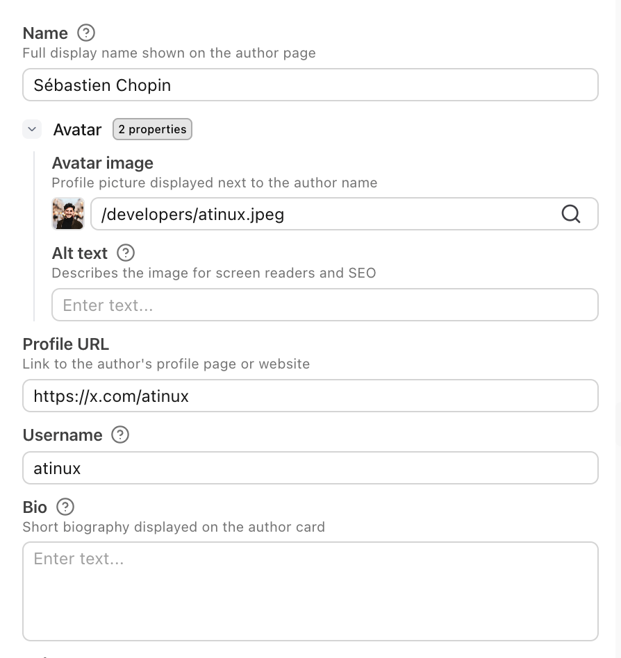
import { defineContentConfig, defineCollection, property } from '@nuxt/content'
import z from 'zod'

export default defineContentConfig({
  collections: {
    authors: defineCollection({
      type: 'data',
      source: 'authors/**/*',
      schema: z.object({
        name: property(z.string()).editor({
          description: 'Full display name shown on the author page',
          tooltip: 'Use your real name or well-known alias',
        }),
        avatar: z.object({
          src: property(z.string()).editor({ input: 'media', label: 'Avatar image' }),
          alt: property(z.string()).editor({ label: 'Alt text', tooltip: 'Keep it short: "Jane Doe avatar"' }),
        }),
        bio: property(z.string()).editor({
          input: 'textarea',
          label: 'Biography',
          description: 'Short biography displayed on the author card. Aim for 1–2 sentences.',
        }),
        role: z.enum(['creator', 'maintainer', 'contributor']).editor({
          tooltip: 'Controls what badge is shown on the author card',
        }),
      }),
    }),
  },
})
Code Editor
The Monaco code editor provides full control over your content, allowing you to write raw content directly:
MDC syntax for Markdown files or JSON or YAML syntax for others.